FinTech - mobile app
Banking - Stock exchange
Banking - Stock exchange
Sketch
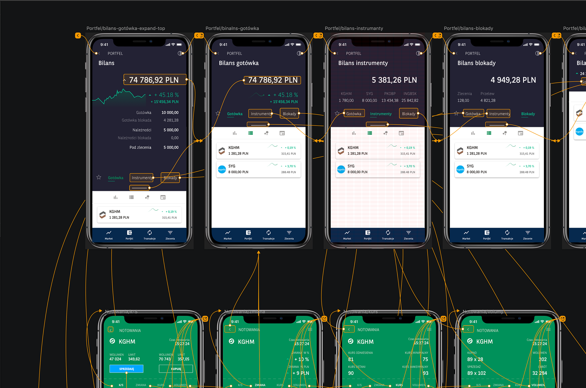
Principle app - basic wireframe interactions
Problem
Most applications require users to navigate through multiple steps/pages to access desired information.
Solutions
Design screens divided into two sections: a preview section and a management section. These sections remain visible and accessible at all times, and can be expanded as needed to provide additional information.
My role
Research, business analytics, UX ,UI
Scope
Self-started project in collaboration with a stockbroker
Key Features
Flexibility
Adjusting the top and bottom parts of the layout to visibility needs in an easy way - through a minimalist icon placed in the center of the screen.
Informative
Increasing the space provides more detailed information.
Flows
Taking into account all user flows and minimizing the number of transitions.
RESEARCH
To determine the best way to assist patient users, I needed to spend some time researching the context and creating design personas.
Topic RESEARCH
This project will focus on unintentional "getting lost" in the application, which accounts for about 30% of cases where users abandon the purchasing process.
Unintentional non-compliance occurs when the user wants to obtain more information but doesn't know where to find it, encountering barriers that prevent them from doing so.
69% of cases result from behavioral issues, such as forgetting, lack of knowledge, unfamiliarity with financial instruments, or confusion around complex descriptive schemes.
16% of cases result from unclear costs.
15% result from adverse effects.
INTERVIEW WITH A SUBJECT MATTER EXPERT
An interview with a stockbroker allowed me to better understand the experiences of clients who get lost while searching for information and the consequences of such actions.
Most of his clients, many of whom have encountered this problem, are "new" individuals who are inexperienced and lack knowledge about investing in financial instruments.
Most of his clients, many of whom have encountered this problem, are "new" individuals who are inexperienced and lack knowledge about investing in financial instruments.
"TRADING ON THE STOCK MARKET IS DIFFICULT"
There is a need to improve the delivery of comprehensive information. This involves minimizing the support provided by customer service and increasing users' independence in using the application. Everyone shares a common goal, which is to navigate the application more efficiently by providing more information on each screen. Fragmented and uncoordinated information is the cause of misinformation.
"YOU NEED TO BE KNOWLEDGEABLE TO PLAY THE STOCK MARKET."
People who lack information/knowledge are usually discouraged by the time required to acquire the relevant information, as well as the additional time needed to obtain the latest updates.
UX
After conducting an interview with the subject matter expert, I realized the importance of making this application accessible to individuals who may not necessarily be "versed in stock market investing."
Upon studying UX, I discovered that in optimizing the technology, the following are crucial:
Clarity of information is paramount - caution should be exercised not to overload the screen with too much information.
It's important to clearly separate the section with additional information from the executive section.
Avoid using multiple fonts and employ a clear hierarchy of content with font weight.
Ensure that interfaces are flexible for a deeper understanding of a given context.
Make sure the user flow is logical and sequential.
Provide reminders/alerts indicating/prompting next actions.
COMPETITIVE ANALYSIS
To understand the strengths and weaknesses of the current market, I downloaded and analyzed various applications. I also examined the color palettes of applications available on the market to determine suitable colors for my application.
Most applications are similar to each other, focused on a linear design sequence, which significantly hinders the acquisition of necessary information.
Most applications are similar to each other, focused on a linear design sequence, which significantly hinders the acquisition of necessary information.
PERSONA
Drawing on insights gathered from both the interview with the subject matter expert and thematic research, I created a persona that reflects my target user base.
CUSTOMER JOURNEY MAP
I created a customer journey map to visualize the current user experiences.
USER FLOWS
I identified two main paths that users can follow to achieve the goals of the persona.
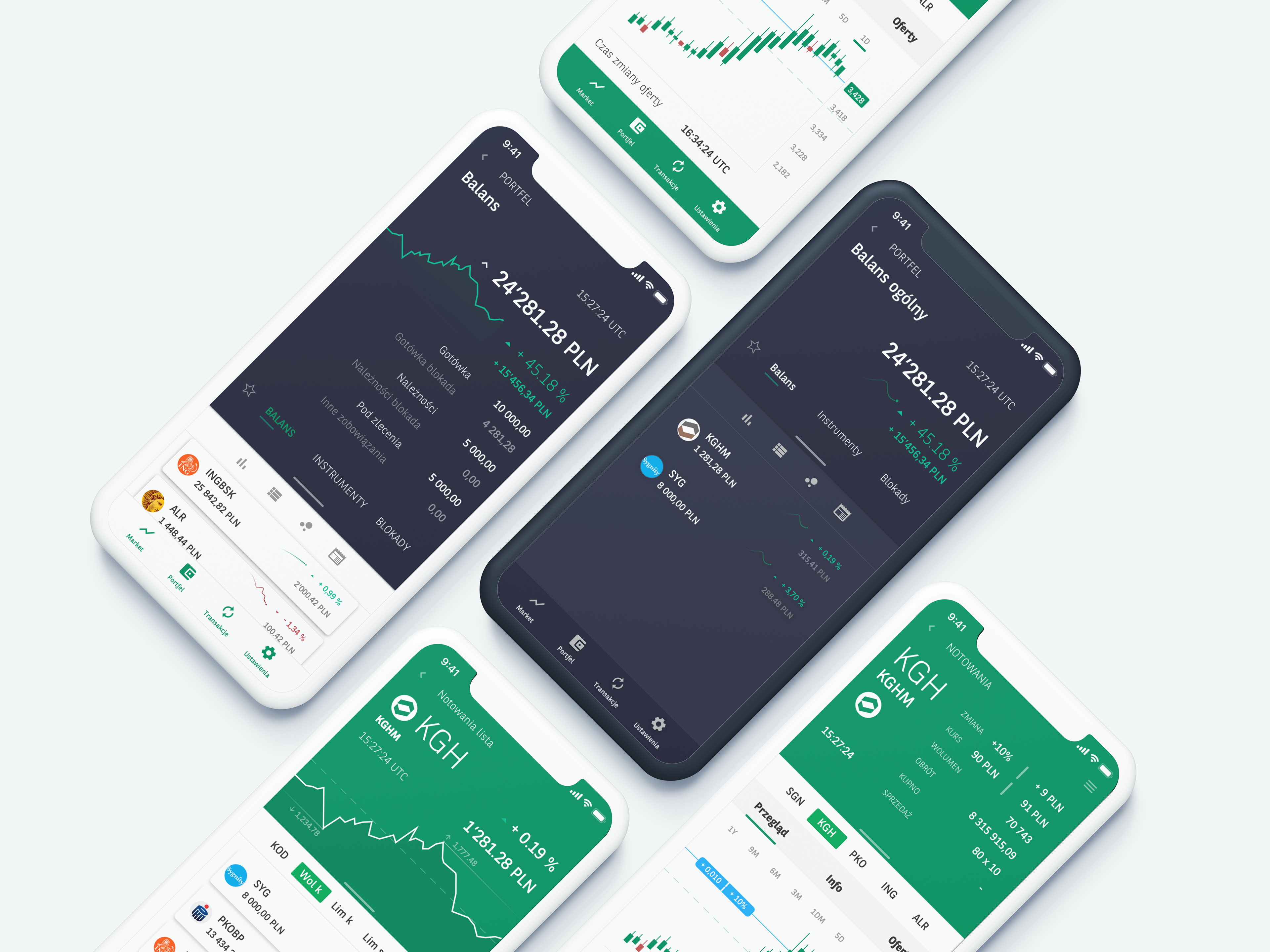
SKETCHES & PROTOTYPES
Sketching helped me roughly understand the key screens and plan necessary functions. Building an interactive prototype allowed for further analysis through successive usability tests.